Recycling Haussmann
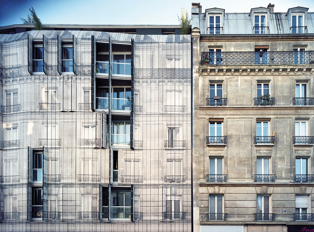
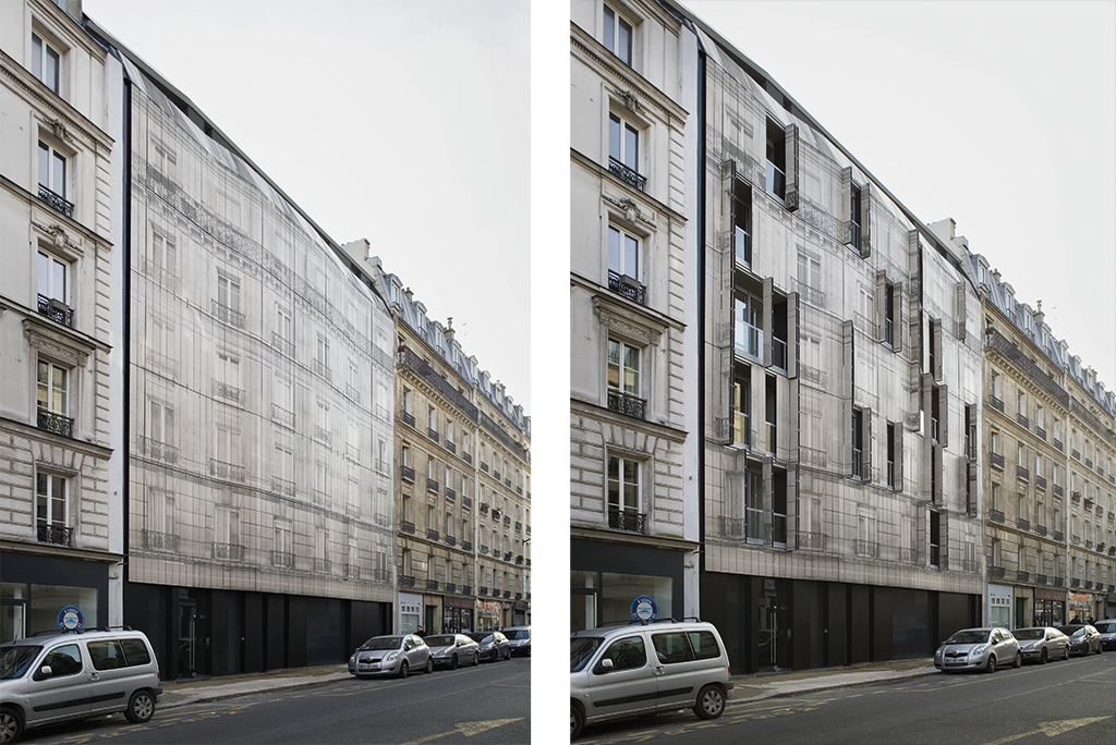
Completed in 2017 in the 18th arrondissement of Paris, a 12-apartment building cladded in Trespa panels presents a trompe-l’oeil Haussmannian façade designed by French office Chartier-Corbasson. This cladding imitating its neighbour made it possible to visually insert the building into the existing alignment without mimicking it. Explanations by Thomas Corbasson.
Paris and its façades aligned with the street, each with a courtyard, a “rear” side, is the city envisaged by Haussmann. It met his requirements for a stratified urban organisation and was the target of much criticism back in our days in architecture school, when the imperative was to open Haussmann’s model and break up with this notion of interiority. Today, aims have changed and the necessity of our times is to build dense cities. The challenge, as always, is to increase profitability but also to counter urban sprawl and protect resources. From this standpoint, Haussmann’s vision of urban planning possesses qualities after all. This little lot in the 18th arrondissement of Paris, entrusted to us to by a brother and sister in 2010, did not offer the possibility of breaking the Haussmannian wall. Might as well sublimate it then!
The site seemed like a missing tooth from the moment we saw it, a break in the ribbon of Haussmannian façades. In a context like this, the façade drives the project. Ours is the fruit of a long process of maturation, relying from the outset on the specific characteristics of the two adjacent façades — one painted, the other faced with cut stone — to ensure the transition by means of transformed materials. Eventually a material was developed that could reproduce the photograph of a Haussmannian façade, thereby ensuring our initial idea of continuity. Respecting the Haussmannian ribbon was indeed at the heart of our relationship with the client. Our project had to be at least as good as the Haussmannian model, wich was the point of reference and pivot of our respective requirements. Among these were a desire for light in the common areas, a spacious staircase and not a mere concrete shaft, built-in doormats and letterboxes, a lobby clad in cut stone or an equivalent, hardwood flooring throughout, etc.
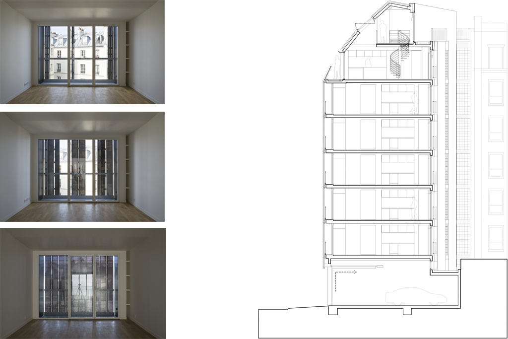
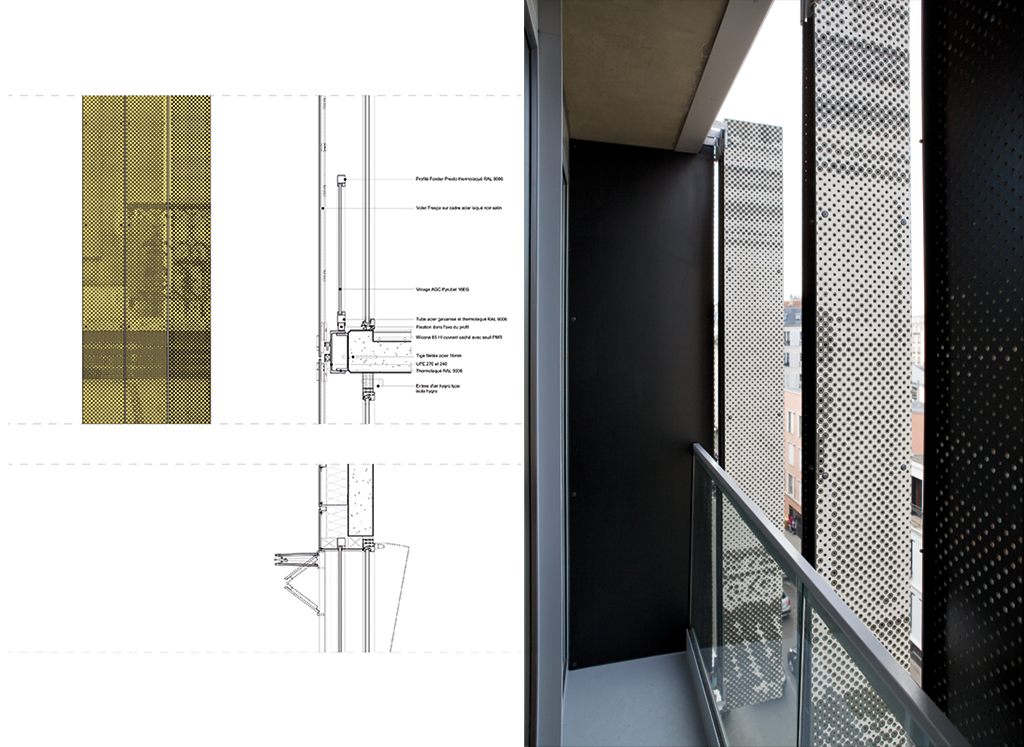
Like the façade, the general layout restores continuity with adjacent courtyards while creating setbacks required to open views. We made sure all flats benefit from double exposure to avoid reproducing what we see as the main drawback of Haussmannian architecture, i.e. the spatial distribution between courtyard and street. To achieve this, the apartments (essentially 2- or 3-room flats intended as rental units) are organised around a large central living area with double exposure, equipped with alcoves containing kitchenettes, wall-to-wall, floor-to-ceiling windows on each façade and balconies whose printed shutters form the trompe-l’oeil façade, the transposition of a photograph of the contiguous buildings.
The technique employed to reproduce the image takes full advantage of the characteristics of the wood and resin composite used for the panels, a material whose dark “soul” contrasts with the treatment of the surface, in this case a cut stone hue. Observation of the method of fabrication literally reveals the soul of the material. We took a photograph we had made and applied a vector graphic process to it, similar to the one used in printing newspapers. This image was transposed onto the panels in the factory — to a depth of 2 millimetres. The entire process was digitally implemented. Our office produced 450 vector files, each one unique, and sent them to the manufacturer. The process was carried out by a script, in other words, by an algorithm we developed, taking into account the technical data received from manufacturer, builder and architect. It enabled the machining onto panel surfaces up to a maximum of 20%, corresponding to the manufacturer’s warranty requirement, of a vector graphic with the precise dimension of 27 millimetres applied across the entire surface of the building. This allowed for: screws spaced every 54 centimetres; the dimension of a storey, 2,700 millimetres; and of a shutter, 270 millimetres. The algorithm we developed also integrated the available cutters with a minimum dimension of 6 millimetres. At the time, we had to use the cumulative computing power of our entire office network during a whole weekend to ensure sufficient calculating capacity to generate the vector image. The resulting design composed of lines resembles a photograph. Though a truncated reality, it fully respects Haussmann’s alignment.
This article by Thomas Corbasson has been previously published on AA’s 429th issue – Ornament – released in March 2019. Buy your copy on our online shop.
Architect: Chartier-Corbasson
Programme: 12 apartments: 5 T2, 5 T3, 1 studio, 1 T4 in duplex and a parking of 12 places
Surface: 932 sq. metres
Completion: March 2017
—


