Tower of Knowledge
Until 12 February 2023, arc en rêve presents " Salle de classe, architecture de l'adolescence " in Bordeaux, an exhibition dedicated to the classroom as a medium of learning and adolescent sociality. What is the link between secondary education and the workplace and to what extent can a professional kitchen be understood as a conventional classroom?
As part of the arc en rêve papers series, the supplements of the Bordeaux architecture centre published in partnership with L’Architecture d’Aujourd’hui, after the South Africans Ilze and Heinrich Wolff and the German Hermann Kaufmann, the curator Joaquim Moreno and Leonardo Lella, exhibition manager at the arc en rêve architecture centre, talk to the Belgian architect Xaveer De Geyter. Together they discuss the Elishout Kitchen Tower project in Anderlecht, Belgium, a tower with cooking classes attached to a higher education campus for the hospitality industry.
ELISHOUT KITCHEN TOWER, ANDERLECHT

Joaquim Moreno: We started this research trying to deal with adolescence. Teenagers got a lot of autonomy during the pandemic, they learned how to study at home, how to network, they changed a lot but after the lockdowns they came back to their conventional, stiff classrooms. That’s why we decided to focus neither on primary schools nor on universities, but really on high school and especially on classrooms…
Xaveer De Geyter: We have been designing a lot of schools in the last years, at least ten, but not all of them were built. I would say that every school is pretty different but in general what does not change that much is precisely the classroom. Even if the use of classrooms according to the age of the students might be quite different, the very traditional configuration with the teacher in front and the pupils behind, sitting in rows of tables, is always possible in our projects. The classroom is basically still a rectangular space with preferably daylight coming in by the left, the teacher standing next to a board and in general a space which is slightly shorter along the façade than in depth, although there is also an alternative model, a more L-shaped classroom with basically the same surface. When you combine the two L-shapes in a kind of U with a wall in the middle, you get a corridor that has niches, and which become very practical for outside activities. At the office we noticed that most schools ask for one of these two models.
In the Melopee School we completed two years ago in Gent for instance, classrooms have a relatively classic form, while what is quite innovative is the use of ground. The project provides an answer to the problem many politicians or school directors are facing today, who very often don’t have enough space to extend their schools. What takes the most space in general are the playgrounds. In this specific case, each school—a crèche, a day-nursery, an elementary school and a sports hall—needed its specific outside spaces. Simply because of the fact that we didn’t have enough surface for all these facilities, we were allowed to stack them on top of each other and make a very theatrical outside space overlooking the city of Gent.
Leonardo Lella: And this is what you also did for the Elishout Kitchen Tower in Anderlecht, right?
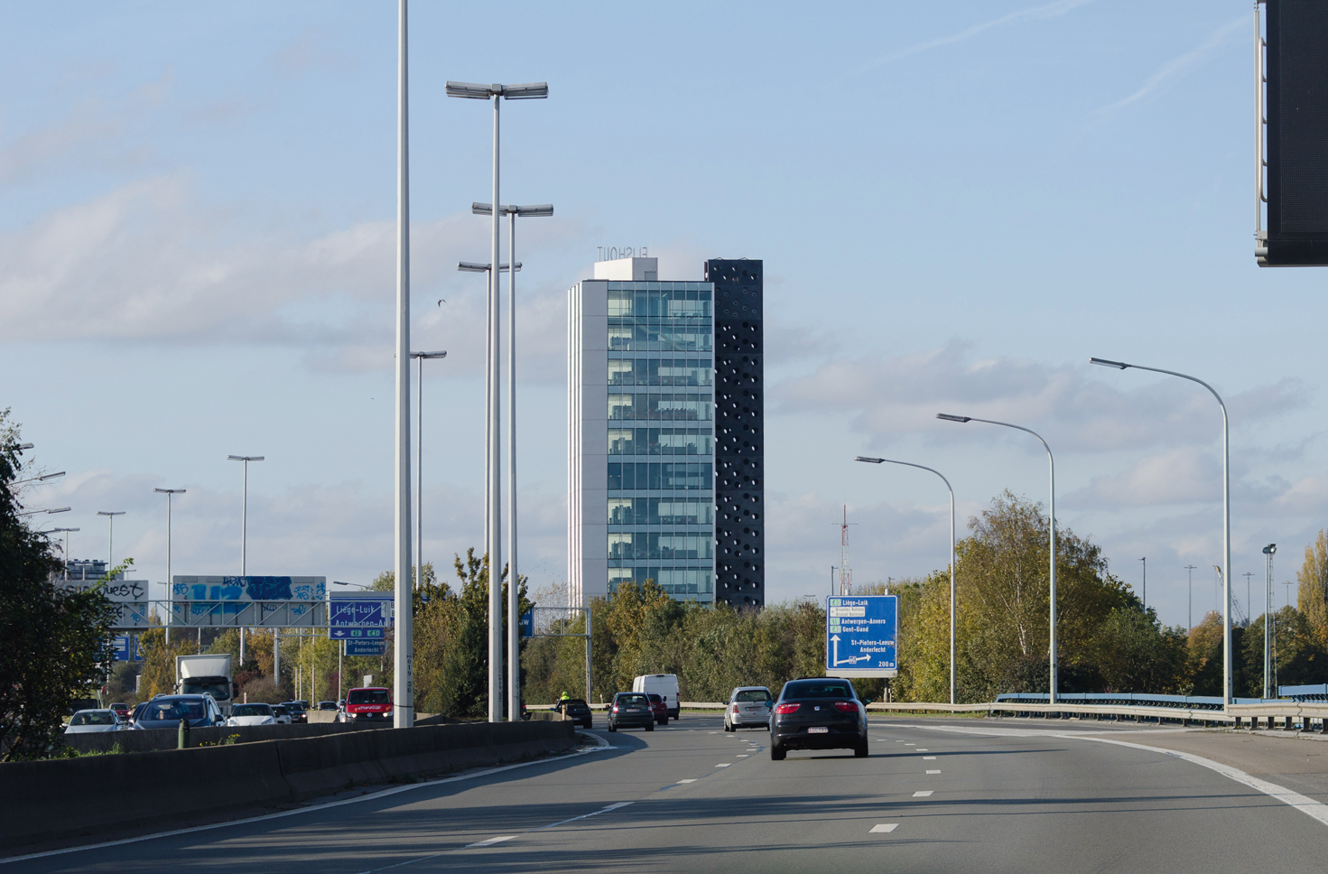
XDG: Yes. Here again, the reasons to design a tower had nothing to do with the classrooms. I would rather say the contrary: the form of the classrooms was a result of the choice to design a tower. We chose this typology because the building is part of a campus-like hotel school, which following a very Belgian tradition is divided in a French-speaking and a Dutch-speaking part. The campus dates back from the sixties, it’s kind of a beautiful traditional modernist campus, but with a limited surface for possible extensions. So, our first reason to design a tower was to reorganize the layout of the campus, making a whole new focus point. The second was to use as little ground as possible in order to preserve the surface for future extensions. And the third was that the campus is located on a piece of land that back in the sixties was in the outskirts of Brussels but that today it is surrounded by pretty un-dense residential areas and is cut by the ring road that run all around the city. We thought it was necessary to make the campus visible from the bypass. Like any other commercial company would do with its brand.
JM: In the exhibition “Classroom, a teenage view”, we decided to present the Elishout Kitchen Tower in the section “Profession”. Professional schools are of course kind of particular because next to the regular classrooms they generally feature workshops for mechanics and carpentry and today new spaces for subjects like digital commerce, 3d printing and so on. In the Kitchen Tower for instance there are no classrooms but only kitchens and a restaurant on top. Do you think these spaces can still be considered as classrooms?
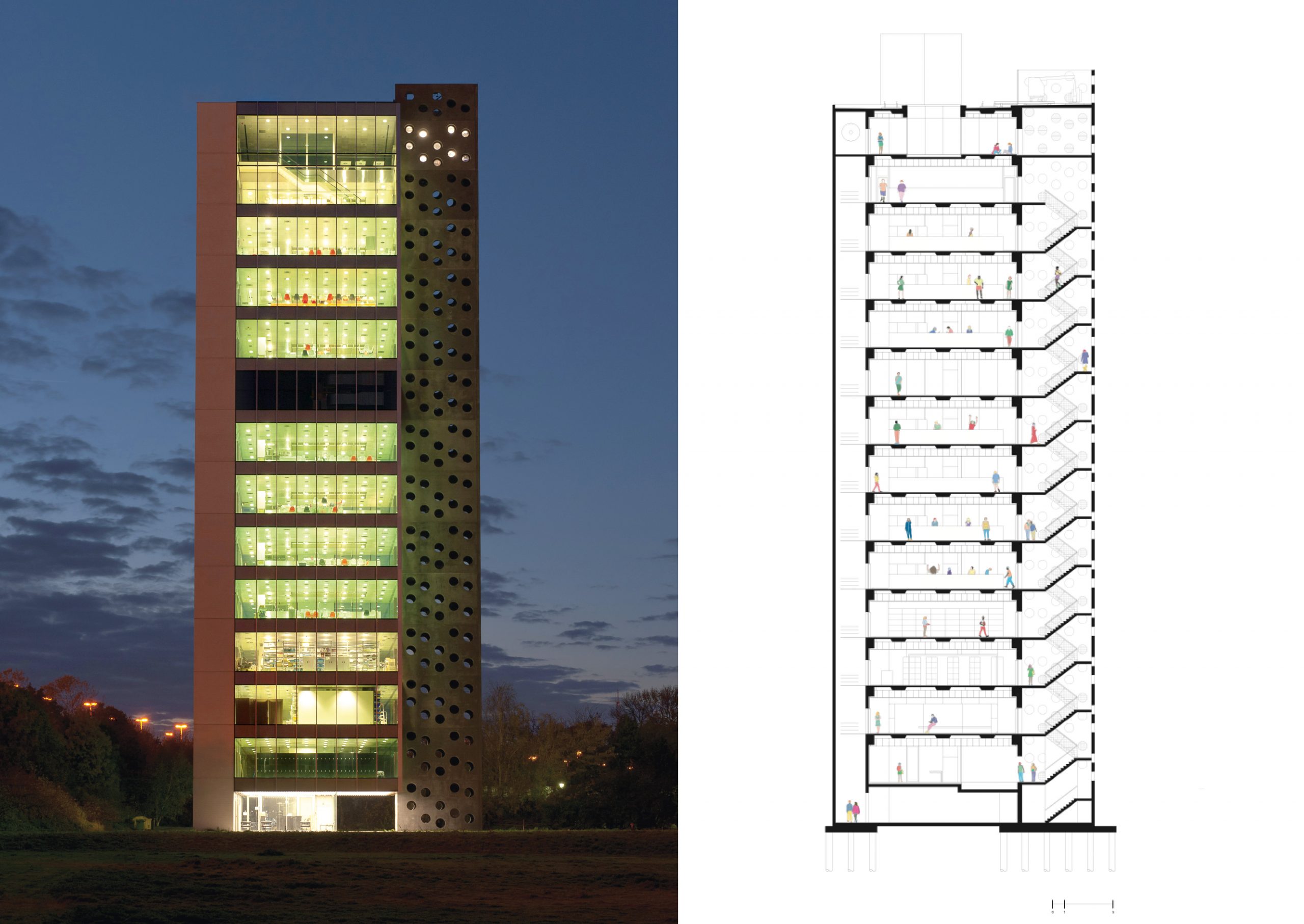
XDG: I definitely think so! Each floor is basically a learning space full of stainless-steel cooking equipment. The “exams” are taking place in the restaurant at the top floors, where the food can be tested. In the school two type of students are taking classes: there are teenagers who learn to cook but also older people who want to reorient their professional life taking cooking classes in the evening. The traditional classroom I described before is in this case quite exceptional simply because of the tower typology which is wrapped by four glass walls without sunscreen. This provides splendid views towards the city as well as towards the ring road.
LL: You mentioned the layout of the “cooking classrooms”. Can you tell us a little bit more about how the space is organized and how the courses are happening?
XDG: In each classroom there is one big table around which a class of 15 people can sit and professional cooking equipment, which would be sufficient for any good restaurant. Teachers are generally starting the courses at the head of the table with all the students around it. After the explanations, students start to cook at the different workplaces and teachers are wandering around…
LL: How did you positioned the different functions along the tower?
XDG: The building is basically the inversion of a traditional tower with a service core in the middle and the usable floor area around. We designed a tower that has only one room per floor but that still needs on the one hand two emergency exits and several elevators (they bring up entire classes of students!). We spread out all of the functions you would generally finds inside one core along the sides of the building. With their glass façades, the classrooms are as elementary as possible. We didn’t use any sunscreen for a very simple reason: since the spaces are professional kitchens, every room is equipped with a huge mechanical installation for refreshing the air. This kind of system can refresh one room in less than 10 minutes. So, in summer there is no need to screen the glass façades since the cooking fires warm up the space way more than the sun.
LL: In a hotel school you have of course a lot of technique and in a vertical structure even more than in a horizontal one. How did you deal with all this technical equipment?
XDG: We just took the traditional service core and created five or six around the central space. The three small ventilation ducts are facing the highway, next to a goods elevator. The vertical movement of people happens in between these shafts, in glass elevators. To make the ducts not too big, we put one technical floor in the middle of the tower, diminishing the distances and therefore the size of the ducts. Two emergency stairs are placed along two other façades. This system allowed us to use no additional structural element, we just added a beam that goes all around and makes the link between the cores.

JM: I always associate your project with Louis Kahn’s Richards Medical Research Laboratories in Philadelphia (1965) with all the technical cores outside and the cantilevered corners…
XDG: I would say the big difference with it or with all high-tech architects like Renzo Piano or Richard Rogers is that we decided to don’t show the technique. It is contained in the building. But that’s a stylistic issue, I guess.
JM: Another association I make is with the traveling in the Peter Greenaway’s film The Cook, the Thief, His Wife and Her Lover, played vertically. I was there by the way a few months ago and I noticed that the view towards the ring road is blocked by the elevators…
XDG: Not really. Through the north and the south façades, you can clearly see the bypass. Furthermore, you have framed views on the highway in between these four little cores and in the elevators which are transparent.
JM: Well, that makes sense, since the facade facing the highway is the one that you wouldn’t see in a moving car. You would see the other ones approaching the building from the north or the south. It is very staged, in a sense…
LL: The fact of putting all the vertical service cores along the sides of the building allows for a total flexibility of the spaces. Can you imagine another function for them?
XDG: We were actually never asked to design flexible spaces. We were simply asked to deliver a number of kitchen classrooms. I don’t think however that changes in kitchen, let’s say from traditional kitchen to vegan or whatever, will have a big impact in terms of space or of cooking equipment.
JM: It’s a very clear project in terms of organization. Both in section and in plan. It looks a very efficient…
XDG: It was actually also daring, because basically we weren’t allowed to go that high. And there was also a big price difference compared to an ordinary kitchen building. When you compared the price of one glass window to four glass walls, you understand that we went quite far, I think. But the clients were ready to pay extra for this simply because of a question of representation. When they welcome guests from outside they are of course very proud of the incredible views you have from the restaurant space.
Exhibition « Salle de classe, architecture de l’adolescence »
arc en rêve centre d’architecture, Bordeaux
Until 12 février 2023


